ThriveCart and Encharge Integration Explained: Pros, Cons, and Real Talk


Let’s talk about the hottest tech stack conversation for course creators right now: ThriveCart and Encharge.
If you’re a course creator, digital product seller, or service provider trying to automate your sales and onboarding flow for a high converting post-purchase nurture funnel, and you’re down to slash costs with a banger of a lifetime deal, this combo might be exactly what you need.
But how do Thrivecart and Encharge actually work together? Is it seamless? Clunky? Worth the effort? And why Encharge now, when it’s been around for years?
In case you missed it: Right now, Encharge is available as a lifetime deal on AppSumo for only $119 for lifetime access for up to 5,000 subscribers. Yep, you read that right. No monthly fees. Just pay once and get access to the Growth plan forever.
If you're even slightly automation-curious, this post might save you serious $$$ (and hours of tech overwhelm).
In this post, I’ll walk you through:
- How ThriveCart and Encharge integrate (and what you need to make it work)
- The real-world pros and cons of using them together
- Who this combo is best for (and who might want to skip it)
- How Encharge compares to other popular email platforms
Let’s dig in.
What Are ThriveCart and Encharge and how do they integrate together?
- ThriveCart is a one-time-payment funnel platform that handles payments, upsells, order bumps, affiliate tracking, hosts your courses, and more. Literally the inspiration for this site and template shop, I am in love with Thrivecart and wholly recommend it.
- Encharge is a visual, behavior-based email service provider and automation tool designed for SaaS companies, course creators, and digital product businesses. It’s comparable to Active Campaign, MailChimp, MailerLite, Drip, and Kit (ConvertKit).
💡 Bonus: Encharge has a native integration with ConvertBox, so if you're into smart list-building popups and segmentation—you're covered.
You can connect, or integrate, your Thrivecart and Encharge account for seamless sharing of contact and sales data, allowing you to trigger complex workflows and automations in Encharge after a buyer action in Thrivecart, such as a purchase (main product, bump, or upsell), a rebill, or when the customer is refunded.
🔥 And don’t forget — Encharge is currently on AppSumo for just $119. Lifetime access. Growth plan. Up to 5,000 subscribers. That’s an absolute steal if you’ve been putting off building smarter email flows or if you’re sick of paying ActiveCampaign $200+ a month to email your list..
Encharge vs. Other Email Platforms (When You're Using ThriveCart)
Let’s compare Encharge to some of the other popular email marketing tools specifically in the context of using them with ThriveCart, because let’s face it – if you’re here, you’re already a Thrivecart user or you’re seriously considering it (thanks to the best affiliate bonus on the internet)
Before we crack on with individual email service provider comparisons, let me explain a few jargon-y terms about integrations:
Native integration: this means the email service provider is deeply connected, or integrated, with Thrivecart. When you’re setting up your products, you’ll be able to see your list of tags that you can apply when that product is purchased, refunded, etc. For some email service providers, you’ll see additional options, like Lists for ActiveCampaign or sequences for Kit and Drip.
PRO: doesn’t require Zapier, this is the least “techy” or complicated integration, and it’s super easy to see exactly what tag or list you’re applying, right in Thrivecart.
CON: low key, none that are worth mentioning, except that Thrivecart doesn’t always handle subaccounts particularly well.
API integration: this is basically a partial integration; you’ll add an API key or “write key” like with Encharge that lets Thrivecart know where to send customer data.
PRO: doesn’t require Zapier and in some cases, it sends more robust data or you have more options than a native integration does.
CON: you won’t see your tags in dropdowns like with a native integration.
Third party integration: this means there’s no way for Thrivecart to talk to your app directly, so you’ll need a third party integration to bridge the gap. Popular choices include Zapier, Make, Pabbly, Integrately, SureTriggers, and N8N.
PRO: the options are endless!!
CON: these third party integration softwares carry a cost:
Monthly — Zapier, Integrately, SureCart, etc
Lifetime — Pabbly
Pay per transaction — Make
With that said, let’s do our side-by-side comparison of email service providers that integrate with Thrivecart.
Encharge
Integration with ThriveCart: API integration. Basically, you’ll add your “write key” found inside your Encharge account, and pop that into Thrivecart. Once you set that up (takes about 2 minutes flat, Thrivecart shows you how to integrate with Encharge here), Thrivecart will automatically share key customer data with Encharge, letting trigger automations in Encharge to add your tag(s), send emails, add delays, conditionals, and more. You can also choose to connect Encharge with Thrivecart via webhook but I wouldn’t bother; its more complicated and not worth the hassle. Go with the API integration where you drop your ‘write key’ into Thrivecart.
Best For: Visual thinkers, automation nerds, and folks who LOVE a lifetime deal
Pros:
- Powerful visual automation builder
- Easy tagging and segmentation
- Built-in behavior tracking (page visits, actions, etc.) including some cool behavior triggers that others don't have
- Has a form builder
- Works with ConvertBox
- ✨ PRICE, as Encharge is currently available as a lifetime deal on AppSumo — $119 for 5,000 subs. It’s such an easy-yes.
- New integration (Thrivecart-specific triggers) added on May 29, 2025, however I don't feel you need that trigger; you can make Thrivecart + Encharge work on any tier
Cons:
- Slight learning curve if you’re brand new to automations
- Does not apply tags from within Thrivecart; you’ll need to set up a workflow in Encharge to apply tags, send emails, add them to an email funnel, etc. Further, you won’t be able to apply tags via Learn (Thrivecart’s course platform) behaviors.
- The new integration (Thrivecart-specific triggers) added on May 29, 2025 are available only for tier 6 users or folks on the Plus plan however I don't feel you need that trigger; you can make Thrivecart + Encharge work on any tier
Kit (formerly ConvertKit)
Integration with ThriveCart: Native integration – no Zap needed, see your tags and apply them right inside Thrivecart
Best For: Creators who want simplicity and clean emails without a ton of tech setup
Pros:
- Super easy to get started with, although it can get confusing when you’re trying to understand the differences between emails sent via visual automation or email sequences
- Direct integration with ThriveCart — no Zapier needed
- Clean UI and includes a landing page builder
Cons:
- Not as powerful automations compared to Drip, Encharge, or ActiveCampaign
- Not ideal for heavy segmentation or complex buyer journeys
- Cannot post or catch webhooks — a big NO for me!
- The reporting is not very robust (Drip and ActiveCampaign are better)
- Long-time users report it can be glitchy
Drip
Integration with ThriveCart: Native integration – no Zap needed, see your tags and apply them right inside Thrivecart
Best For: Digital sellers and eCommerce peeps who want deeper purchase behavior flows
Pros:
- Powerful ecommerce and behavior-focused automation logic, including webhooks and website tracking
- Great tagging and customer tracking, including lifetime value tracking
- Native integration with Facebook for lead ads
- Can deliver transactional emails
- Incredibly detailed and filterable analytics and reporting
- Includes access to Onsite, its popup campaign builder including spin-to-win and mystery offer popups
Cons:
- It’s not the cheapest option
- It can be quite techy for some
- Does not include a landing page builder
ActiveCampaign
Integration with ThriveCart: Native integration – no Zap needed, see your tags and apply them right inside Thrivecart
Best For: Users who want full CRM and pipeline functionality baked into their email system
Pros:
- Extremely powerful automations + CRM
- Advanced conditions, scoring, and tracking
- Good for agencies or teams managing multiple clients or products
Cons:
- Steep learning curve as its pretty techy
- Can feel bloated if you don’t need all the features
- EXPENSIVE: AC has multiple pricing tiers, making it quite pricey, and the pricing jumps fast as your list grows
- Many users (myself included) report that it is glitchy and can be unreliable during a launch
MailerLite
Integration with ThriveCart: Native integration – no Zap needed, see your tags and apply them right inside Thrivecart
Best For: Newer business owners who want a solid (but simple) email setup on a budget or need a free plan option, and don’t do much if any affiliate marketing
Pros:
- Affordable (free plan up to 500 subscribers)
- Simple to use
- Decent automation tools for the price
Cons:
- Not designed for complex sales funnels
- Limited conditions/segmentation
- Might feel too basic once you start scaling
- The platform in general frowns on affiliate marketing; some accounts have been shut down for sharing affiliate links
- The ConvertBox-MailerLite integration does not work reliably
A note about Encharge and ConvertBox
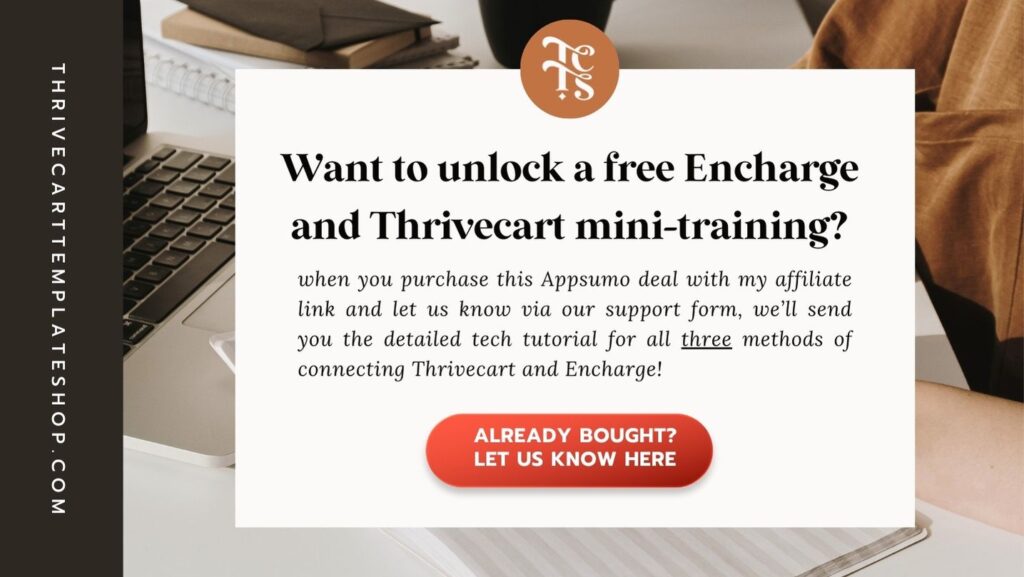
Encharge does connect with ConvertBox, but is not a native integration, eg. you won't see a drop down inside ConvertBox of all your tags to select when setting up your ConvertBox campaign. Instead, ConvertBox will send subscriber data over to Encharge and then you would use an Event trigger to tag that subscriber and add them to an automation or sequence. I am working on a workaround for this though, so stay tuned, and if you bought Encharge with my affiliate link via this blog post or an email from me, definitely fill out this form to make sure you'll receive that workaround training, along with lots of other gems on making the most of Encharge.
Encharge and Affiliate Marketing: What you should know
Encharge does allow affiliate links in emails you send, but they prohibit strictly affiliate marketing only communications. I love affiliate marketing as a sustainable service and part of my business, but it is not my primary focus nor is it my primary way of earning a living. Still, this gave me pause so I reached out to Encharge to talk about it, as I knew others would want to understand the nuance here too.
The kinds of users Encharge loves to work with: creators and business owners who use email marketing to create a relationship between their customers (existing or potential new customers) and the brand. They expect us to use Encharge to share updates, share our products and offers, and connect with our audience. Sharing affiliate links is allowed, as in many ways, it's a service, such as recommending a new tool, software, or resource for folks, similar to this blog post.
⇥ If you send primarily emails about your business or content, which may include affiliate links, you'll be fine. Encharge recommends that you maintain a strong relationship with your audience and protect your (and their) sender authority by maintaining at least 25% open rates and an average of 1% click rates. If you have low open or click rates, work on improving those before diving deep into affiliate marketing via Encharge.
The kinds of affiliate marketing users that Encharge does not want to work with: folks whose entire business model is affiliate marketing; they do not create original products or market anything other than affiliate links. Frequently those businesses rely on spray-and-pray models and sometimes acquire leads in a less than ethical way, so I get why Encharge wouldn't want to work with those sorts of brands.
Have questions? Definitely reach out to Encharge support on this!
So… Which One Should You Pick?
If you want a robust email service provider that can also build landing pages, go with Kit (ConvertKit).
If you want the most powerful automation capabilities, and/or you are a Shopify, Thrivecart, or WooCommerce user, go with Drip. Check out why I love it here.
If you want CRM-level control and are not price-conscious, ActiveCampaign should be great for you.
If you're just starting out and need a powerful free plan, don’t do much affiliate marketing, and don’t use ConvertBox, MailerLite will do the job.
Overall my top pick is Drip for ease and power, with Kit in second place, but if you’re looking for a lifetime deal on an email service provider with powerful behavior-based automation, deep segmentation, smart flows, and a native ConvertBox integration, look no further than Encharge via Appsumo. The tradeoff? You won’t have a monthly fee, but your Thrivecart to Encharge tagging will be a little more work, where your automations in Encharge will start by applying a tag and then you can automate whatever you’d like.
Snag a lifetime deal for $119 for 5,000 subscribers here
💡 Do NOT miss the Appsumo Encharge deal! The Appsumo regular deal is available periodically; click any Encharge link on this page to see if its available now, and if it isn't, check back on this blog post periodically.
If you’re looking for a one-time, super affordable yet powerful option for email marketing with a dedicated support staff that is happy to roll up their sleeves and really help you out, then definitely look into snagging Encharge while its available on a lifetime deal. And once it’s dialed in? You’ll never look back.