Marketing Magic App Review: And Why It’s Better Than ChatGPT

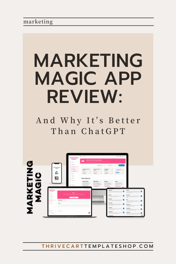
Today, I’m sharing everything I know about the Marketing Magic App and why it’s the go-to tool for personal brands, digital product sellers, and course creators. If you’ve been on the hunt for an AI marketing tool that’s intuitive, powerful, and tailor-made for your unique needs, you’re in the right place.
We all love a bit of AI magic, but let’s be real — navigating ChatGPT can sometimes feel like trying to solve a Rubik’s cube blindfolded. Or being read a technical manual, when all you really wanted was a rough draft of a casual email. The Marketing Magic App, on the other hand, is like having a tech-savvy bestie who just gets you, understands your content and copy needs, and makes everything easier.
In this review, I’ll break down why the Marketing Magic App outshines ChatGPT in every way that matters to us. From its user-friendly interface to its specialized features for different types of online entrepreneurs, this app is designed to make your life easier and your business more successful.
Plus, I’ve recorded a demo video showing how I created the copy for and designed a sales page in just 30 minutes using this app — trust me, you’ll want to check that out.
So, buckle up and get ready to discover how the Marketing Magic App can transform your marketing game and help you achieve your goals with less hassle and more success.
What is the Marketing Magic App?
First off, let’s get acquainted with this gem. The Marketing Magic App is an all-in-one AI platform designed to simplify and supercharge your marketing efforts. Whether you’re building a personal brand, selling digital products, or creating courses, this app has got you covered with its powerful features and intuitive design.
So, what sets the Marketing Magic App apart from other AI tools? It’s designed with you in mind, offering features that cater to the unique needs of different types of online entrepreneurs. From seamless content creation and repurposing to robust sales funnels, this app is your new best friend in the world of digital marketing.
Why It’s Better Than ChatGPT
I love ChatGPT and all, but let’s be real — ChatGPT can be a bit of a beast to tame and it never, never sounds like me. The Marketing Magic App, on the other hand, is like having a smart marketer friend who just gets you and they write. Here’s why:
User Interface:
The app is ridiculously user-friendly. No tech degree required. Everything’s laid out in a way that makes sense, so you can get straight to the good stuff without faffing around.
Imagine logging in and immediately knowing where to go and what to do. That’s the kind of intuitive design we’re talking about. The dashboard is clean, with all the essential tools accessible from the main menu. No more digging through endless options to find what you need.
Setup and Onboarding:
Quick and painless. The app walks you through everything step-by-step, so you’re not left scratching your head.
When you first sign up, you’re greeted with a friendly onboarding wizard that helps you set up your account, connect your existing tools, and start creating right away. It’s like having a personal guide that ensures you hit the ground running.
Features Tailored for You:
Unlike ChatGPT, which can feel like a one-size-fits-all solution (without a ton of customization), the Marketing Magic App has features specifically designed for personal brands, digital product sellers, and course creators. It’s like it can read our minds.
The app understands the nuances of different types of businesses and offers specialized tools for each.
Features Tailored for Personal Brands
For my personal brand builders out there, this app is a dream. It lets you easily customize (and align) your brand messaging. Need to whip up some personal bios for an upcoming speaking gig? The app’s got templates that make it a breeze.
And oh, did I mention? I recorded a demo video showing how I created copy and designed a sales page in just 30 minutes using the Marketing Magic App.
Check it out here: Marketing Magic Demo.
Plus, if you purchase the app through my affiliate link, you get access to a Thrivecart template I designed just for you. #Winning
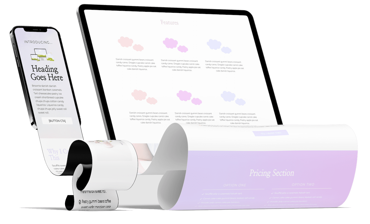
The Marketing Magic App provides you with a suite of tools to make your brand shine online.
Benefits for Digital Product Sellers
Digital product sellers, this one’s for you. The app’s copy capabilities are top-notch.
The efficiency you’ll gain? Off the charts. Unlike ChatGPT, which might leave you piecing things together, the Marketing Magic App is like having your own personal marketing assistant or AI copywriter.
Creating a sales funnel can often feel like trying to navigate a maze. With the Marketing Magic App, you get pre-designed AI templates that make setting up your funnel a walk in the park. You can easily create sales page copy, email sequence copy, and promo posts in one place.
Cost and Value
Now, let’s talk dollars and sense. The Marketing Magic App offers various pricing plans that won’t break the bank. Given the range of features and ease of use, it’s a solid investment. The value it brings far surpasses the cost, especially when you consider the potential ROI.
For the price of a couple of fancy coffees a month, you get a powerful marketing tool that can significantly boost your productivity and profits. The app’s ROI is evident in the time saved and the increase in sales and engagement it brings. And remember, you get a Thrivecart template if you purchase through my affiliate link, adding even more value to your investment.
Free Resources and Goodies
Speaking of value, don’t miss out on my free Overused Words in AI Workbook. It’s packed with tips to help you avoid those repetitive AI-generated phrases and keep your content fresh.
This workbook is a must-have for anyone looking to elevate their content game. It provides actionable tips and strategies to ensure your writing stands out and remains engaging for your audience.
Final Thoughts
To wrap things up, the Marketing Magic App is hands-down the better choice for personal brands, digital product sellers, and course creators. Its user-friendly design, targeted features, and overall efficiency make it a standout in the crowded market of AI marketing tools.
Ready to make some magic? Try the Marketing Magic App today with a free trial and see the difference for yourself. Whether you’re looking to streamline your workflow, create stunning content, or boost your sales, this app has got your back.
Other posts you may want to check out:
- ThriveCart and Encharge Integration Explained: Pros, Cons, and Real Talk
- What is a VSL Funnel & How to Build One in Thrivecart
- 6 Simple Ways to Improve Your Order Confirmation Page in Thrivecart
- Is Your Subscription Membership About To Violate Federal Law?
- Recurring Revenue Businesses: The Pros and Cons of This Business Model


